
Perhaps you have resized/stretched them to make them fit into the game? (wild guessing, I know little about the map editor) Then its possible that the digits have become slimmer and taller than they was. Hence, it makes it look like its another font.ScuL wrote:I don't understand how the font is incorrect.MandelSoft wrote:You're absolutely right: the font is incorrect indeed. I'm on it right now!norguy wrote: Edit: Just onelittle thing - are you sure you are using the right font for the speed sign?:
<snip>
Compared it to some pictures, isnt it a bit different? Perhaps its just mye eyes, but with your font the digits looks a bit slimmer and taller. Not a big problem, just a very minor detail off course
(I also noticed that the French signs are off too, as well as the German ones).
I have copied every single Danish sign in the mod from the official documentation from Vejdiktoratet . I have 10 pdf files with a total size of 20MB that comprise of all Danish signs in existence and that's where these came from.
Development on version 1.x (Current Map Improvements)

It shouldn't stretch really.
Here are all the original signs I made (generally copied from department of transport/traffic or other relevant government body):
https://www.facebook.com/media/set/?set ... 701&type=3
DK signs:

SE signs:

Here are all the original signs I made (generally copied from department of transport/traffic or other relevant government body):
https://www.facebook.com/media/set/?set ... 701&type=3
DK signs:
SE signs:
I am  Dutch living in
  New Zealand and I speak
  EN
EN  DE
DE  SE
SE  FR
FR

-
MandelSoft

- Lead Developer
- Posts: 3835
- Joined: 08 Aug 2013 10:48
- Location: Delft [NL]
Still, the font was incorrect. Probably the document for these signs used a mock-up font for demonstration purposes, and it may be different from what's out there in the field. If I compare it to the field image posted by Norguy, you see quite a difference:

I've corrected the signs on our end by replacing the existing text with text written in the Vejtafletskrift font, the official Danish signage font. During my time I've tried to recreate signage in InkScape, I tend to recognise certain sign fonts, and Vejtafletskrift is no exception to that rule . Other fonts I recognise in an instant are Highway Gothic (and its derivatives like ANWB/RWS Ee), ANWB Uu, SNV, DIN1451, DIN1451 Austria, DIN1451 Hungary, Transport (and Motorway for the British route numbers), Caractères L1/L2/L4, Drogowskaz, Helvectia, Gill Sans, Tratex, Traffikalfabetet and Clearview.
The Swedish ones clearly use Tratex. Those are correct
Best,
Maarten
I've corrected the signs on our end by replacing the existing text with text written in the Vejtafletskrift font, the official Danish signage font. During my time I've tried to recreate signage in InkScape, I tend to recognise certain sign fonts, and Vejtafletskrift is no exception to that rule
The Swedish ones clearly use Tratex. Those are correct
Best,
Maarten
Your daily dose of wisdom!
╔═══╗────╔═╗╔═╗────╔╗
║╔═╗║────║║╚╝║║────║║
║╚═╝╠═╦══╣╔╗╔╗╠══╦═╝╠══╗
║╔══╣╔╣╔╗║║║║║║╔╗║╔╗║══╣
║║──║║║╚╝║║║║║║╚╝║╚╝╠══║
╚╝──╚╝╚══╩╝╚╝╚╩══╩══╩══╝
Don't ask us for a release date; we don't know either.
╔═══╗────╔═╗╔═╗────╔╗
║╔═╗║────║║╚╝║║────║║
║╚═╝╠═╦══╣╔╗╔╗╠══╦═╝╠══╗
║╔══╣╔╣╔╗║║║║║║╔╗║╔╗║══╣
║║──║║║╚╝║║║║║║╚╝║╚╝╠══║
╚╝──╚╝╚══╩╝╚╝╚╩══╩══╩══╝
Don't ask us for a release date; we don't know either.
Nice work. Every detail counts!!
Another font in Austria is the tern typeface which will appear on the newer signs. (Some signs already have this typeface). Might be nice if you use this font too (but not on all signs because Austria doesn't have all the signs changed, it's especially on the autobahnen and the important B-routes) Hopefully you can use this information.
Keep up the great work!!


To be perfectly honest you could have got away with it if you had just squished the font slightly. As long as I can read it I don't mind, though I appreciate everyone has their own opinion.MandelSoft wrote:Still, the font was incorrect. Probably the document for these signs used a mock-up font for demonstration purposes, and it may be different from what's out there in the field. If I compare it to the field image posted by Norguy, you see quite a difference:
Well you have successfully replaced it with the wrong font then.
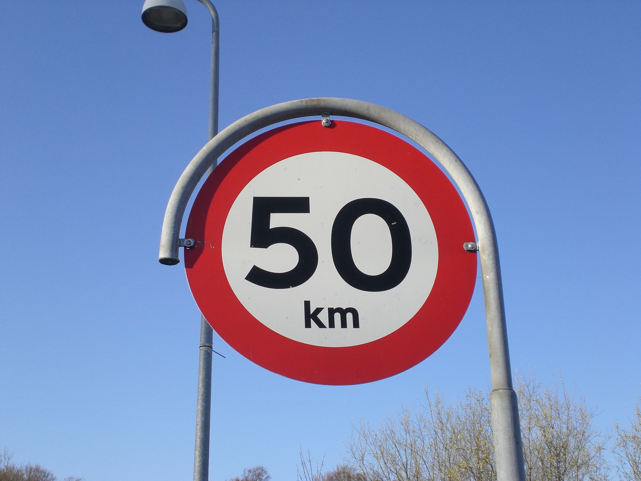
The picture posted by norguy is an old sign (notable by the curvature of the metal post going around the top of the sign) whereas the latest font on the sign from Vejdiktoratet is the new form.
The picture posted by norguy is an old sign (notable by the curvature of the metal post going around the top of the sign) whereas the latest font on the sign from Vejdiktoratet is the new form.
I am Dutch living in New Zealand and I speak EN DE SE FR
-
MandelSoft
- Lead Developer
- Posts: 3835
- Joined: 08 Aug 2013 10:48
- Location: Delft [NL]
I did some more research on Google Streetview, and each sign I see is still printed in Vejtafletskrift:
https://maps.google.nl/?ll=55.505482,9. ... 11,,2,3.96
https://maps.google.nl/?ll=55.606499,12 ... .86,,2,2.1
https://maps.google.nl/?ll=55.620024,12 ... .85,,2,1.7
https://maps.google.nl/?ll=55.632127,12 ... 44,,1,3.45
https://maps.google.nl/?ll=55.854914,12 ... 29.52,,2,1
https://maps.google.nl/?ll=55.952227,12 ... 72,,2,9.46
Actually, on newer road signs, they don't even denote "km" anymore, just the number.
Another thing I would like to note is that we don't always use the latest designs on the map. Yes, I know we have a new dutch signage design, but it's not spread all over the map, just a mixed implementation, like in Real Life. With the speed limit signs in Denmark, something similar holds, and you still see a lot of signs with these curved posts.
Sometimes, research in official documents is not enough: field research is also very important, because what's on paper doesn't necessarily have to be that way in reality
Best,
Maarten
Your daily dose of wisdom!
╔═══╗────╔═╗╔═╗────╔╗
║╔═╗║────║║╚╝║║────║║
║╚═╝╠═╦══╣╔╗╔╗╠══╦═╝╠══╗
║╔══╣╔╣╔╗║║║║║║╔╗║╔╗║══╣
║║──║║║╚╝║║║║║║╚╝║╚╝╠══║
╚╝──╚╝╚══╩╝╚╝╚╩══╩══╩══╝
Don't ask us for a release date; we don't know either.
╔═══╗────╔═╗╔═╗────╔╗
║╔═╗║────║║╚╝║║────║║
║╚═╝╠═╦══╣╔╗╔╗╠══╦═╝╠══╗
║╔══╣╔╣╔╗║║║║║║╔╗║╔╗║══╣
║║──║║║╚╝║║║║║║╚╝║╚╝╠══║
╚╝──╚╝╚══╩╝╚╝╚╩══╩══╩══╝
Don't ask us for a release date; we don't know either.
-
n4gix.bill.leaming

- Posts: 1196
- Joined: 07 Aug 2013 18:22
- Donation rank:

- Location: Hammond, Indiana
- Contact:
To be perfectly frank, since I typically don't park next to such speed signs, but rather blow by them at, or just below the posted limit...
...I'd never notice the relatively tiny difference in "fonts" anyway. There is such a thing as too much attention to detail after all; it can become a virulent form of rectivisualitis.
...I'd never notice the relatively tiny difference in "fonts" anyway. There is such a thing as too much attention to detail after all; it can become a virulent form of rectivisualitis.
Fr. Bill
Global Moderator
Interests: Gauge Programming - 3d Modeling for Milviz
Global Moderator
Interests: Gauge Programming - 3d Modeling for Milviz


Some new progress in Denmark today with new signs from Mandelsoft, new overlays from ScuL and some new roads from me 
Enjoy!
New crossing at Vejle (open since a few weeks!! IRL)


The new road between Vejle and Herning (so irl a couple of weeks old. At least the last bit )
)

Enjoy!
New crossing at Vejle (open since a few weeks!! IRL)
The new road between Vejle and Herning (so irl a couple of weeks old. At least the last bit
Am I developing at the moment?

STDS, ETS2, ATS Beta Tester
Main Developer of ProMods and Moderator.
STDS, ETS2, ATS Beta Tester
Main Developer of ProMods and Moderator.
